Repositioning a legacy publisher into a modern marketing solutions brand
The challenge & insight
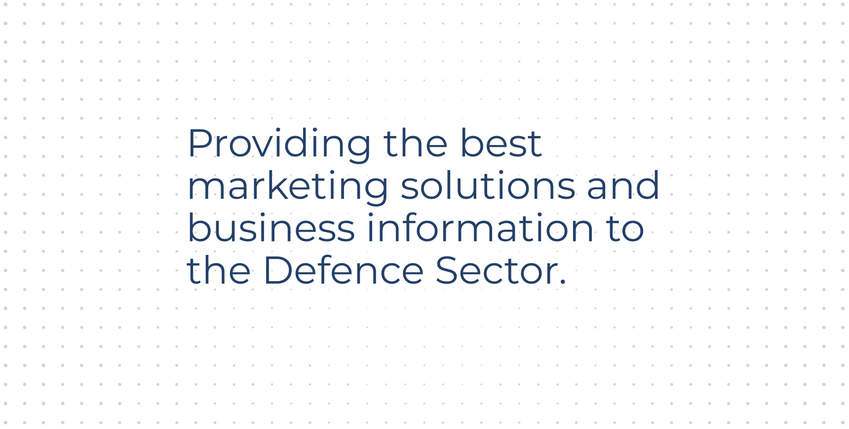
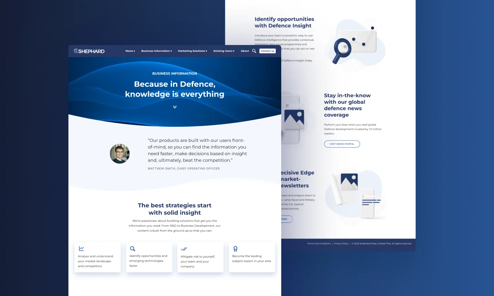
Shephard Media, one of the largest publishers in the defence industry, was evolving its commercial offering. While the business was moving beyond traditional journalism, brand perception had not kept pace. Externally, Shephard remained closely associated with “guns, tanks and ships” reporting, which limited its credibility as a modern provider of marketing solutions and business intelligence. Internally, the brand had not evolved in line with the new positioning, leaving teams without a clear, contemporary visual language to represent the wider offer.

The solution
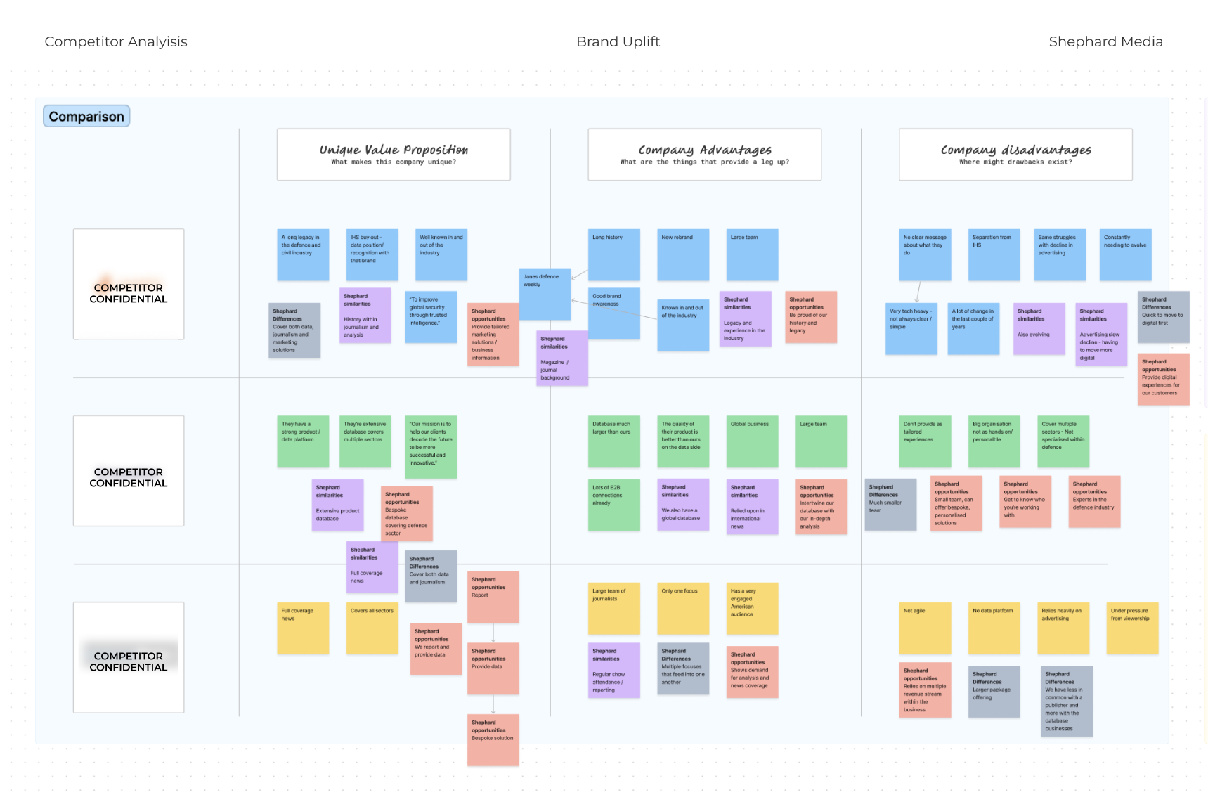
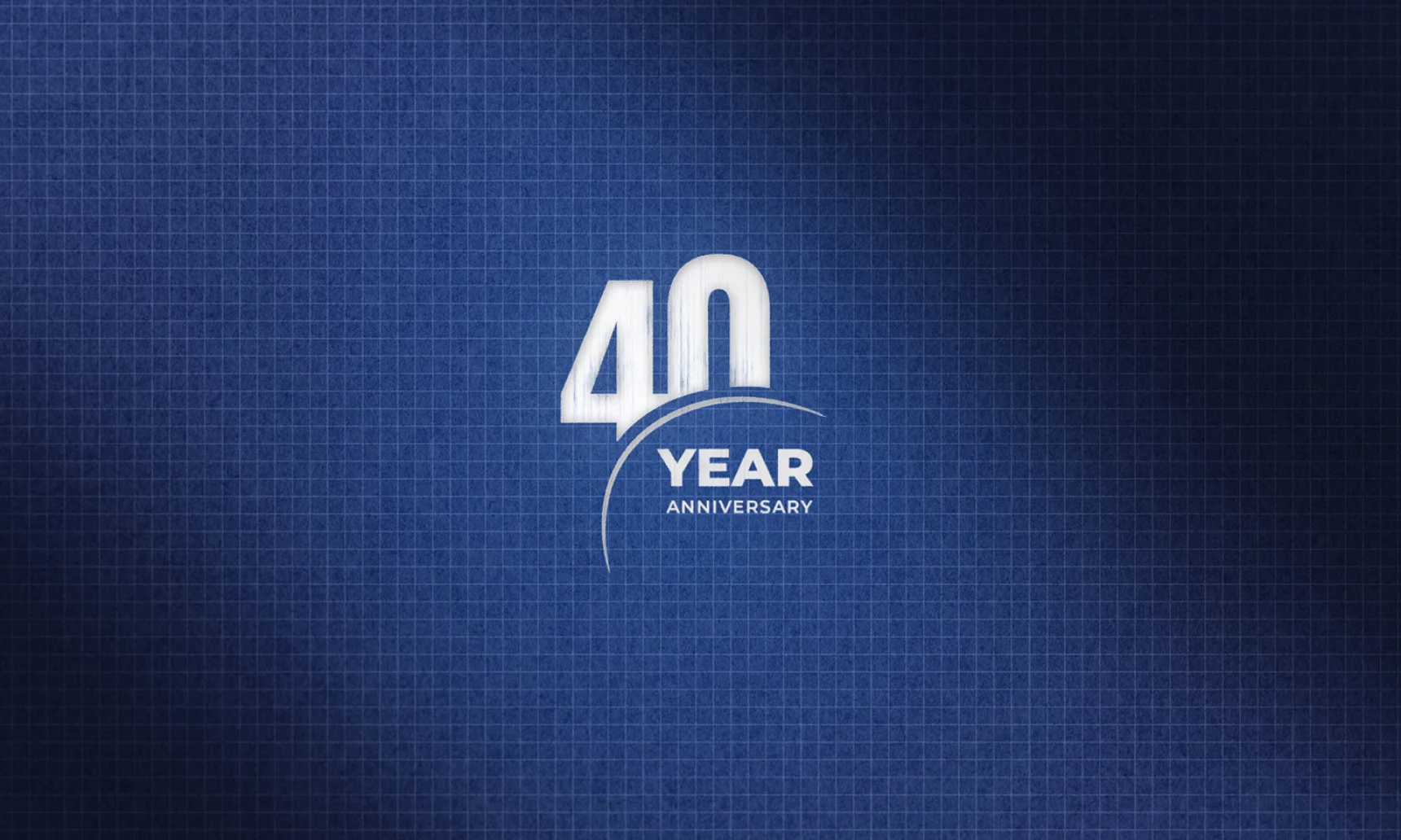
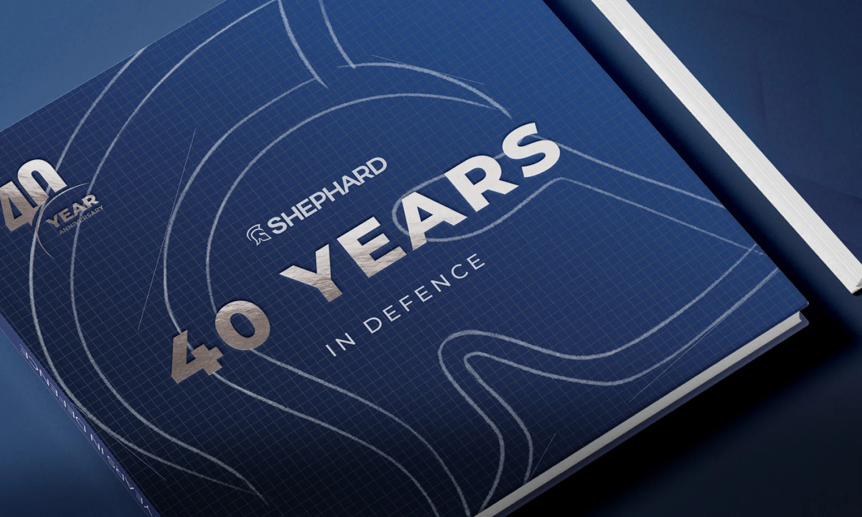
With over 40 years of heritage, Shephard’s brand carried significant legacy. That legacy meant different things to different people across the business. The first priority was clarity. I led a series of internal workshops to define what the Shephard brand is, and just as importantly, what it is not. This was supported by a detailed competitor review to identify where Shephard could credibly stand apart in a crowded and often visually conservative market. Through this process, the Senior Leadership Team aligned on four core brand attributes: bold, engaging, trustworthy, experts. These principles became the foundation for all subsequent design decisions.
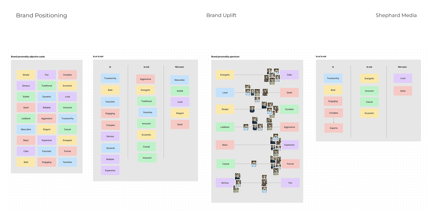

The strategy
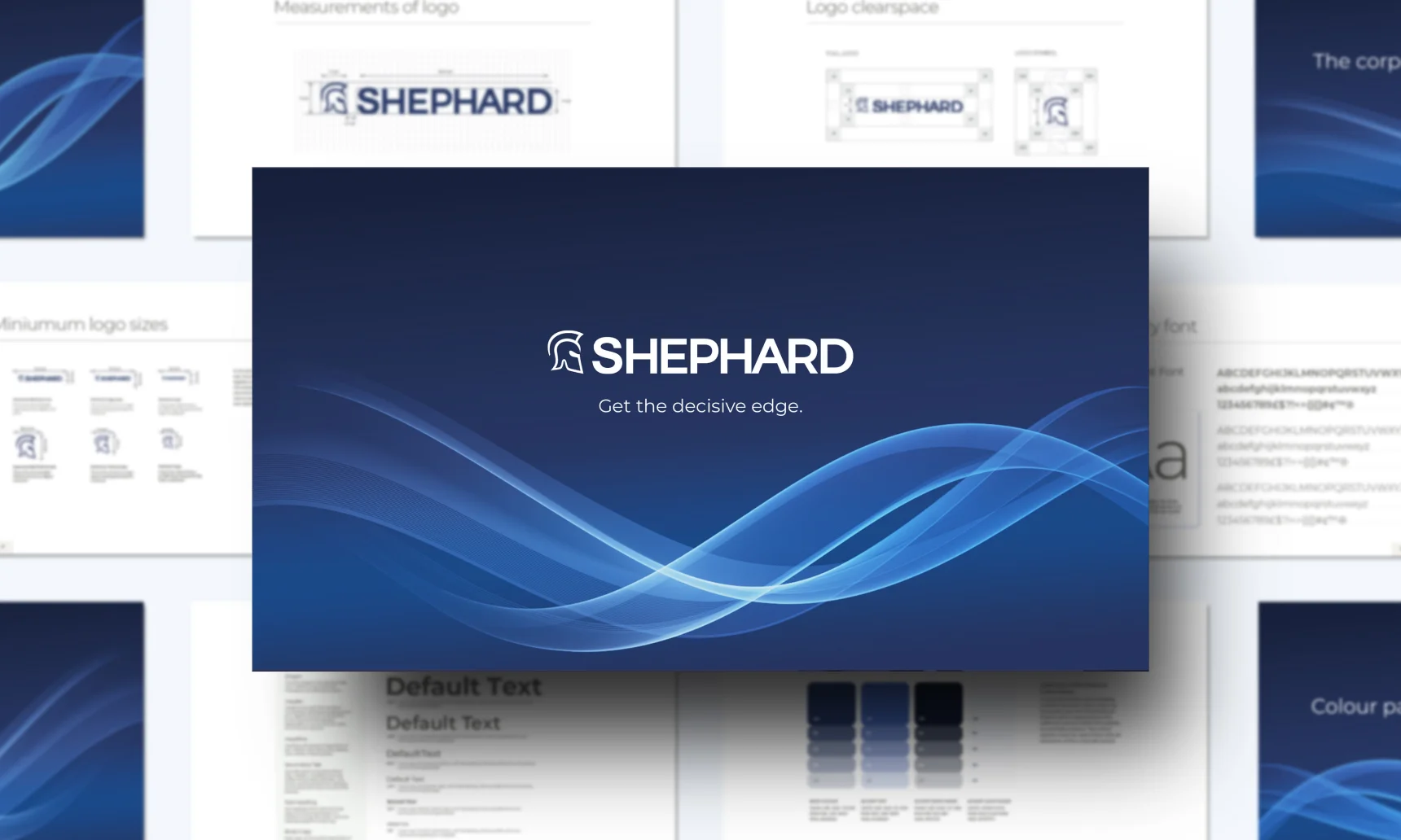
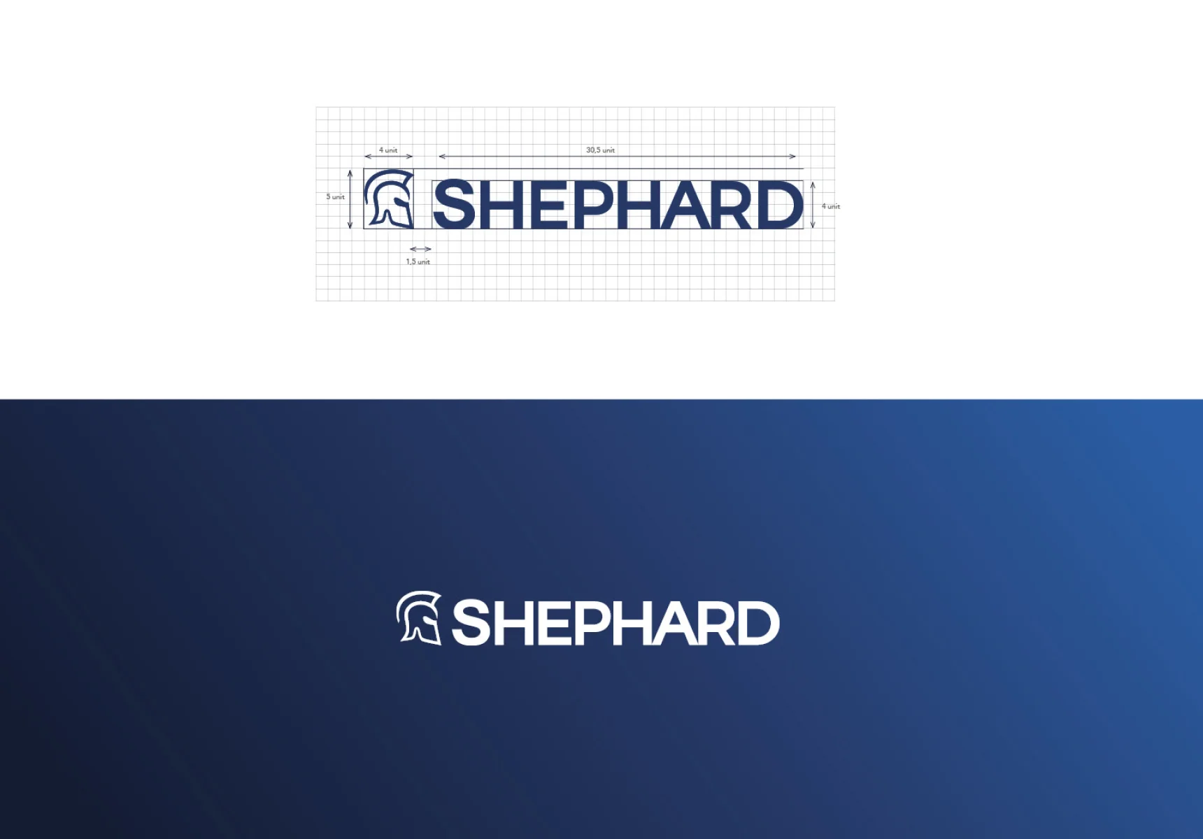
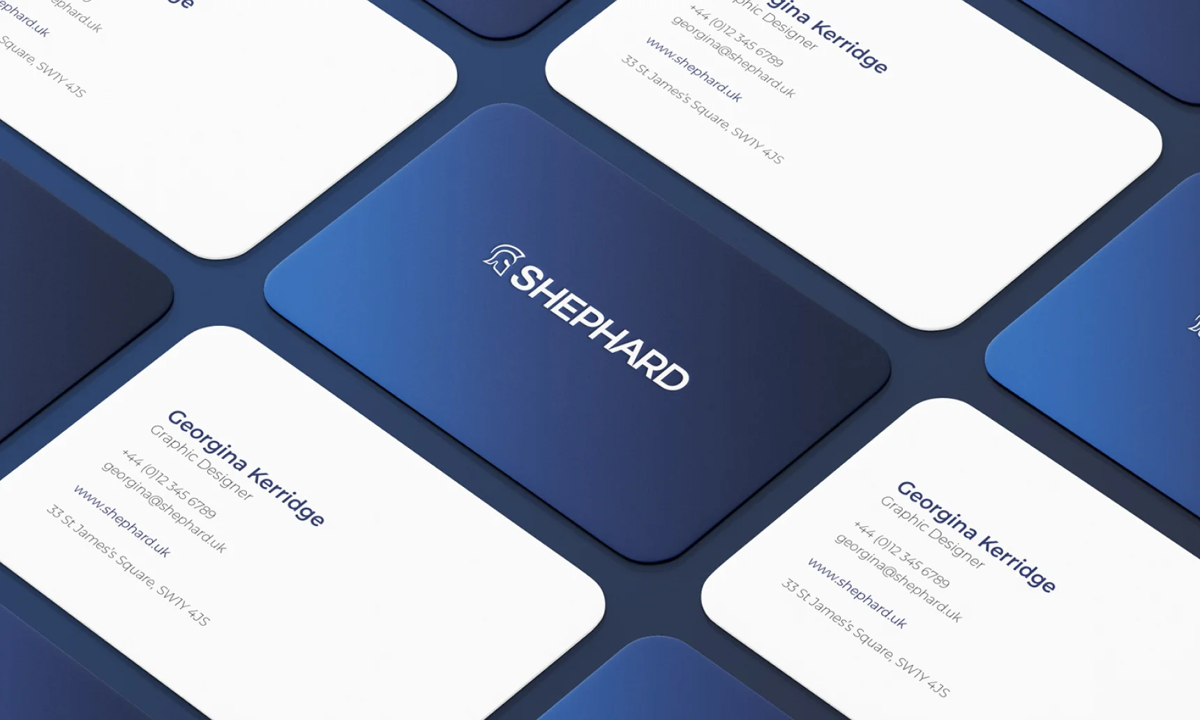
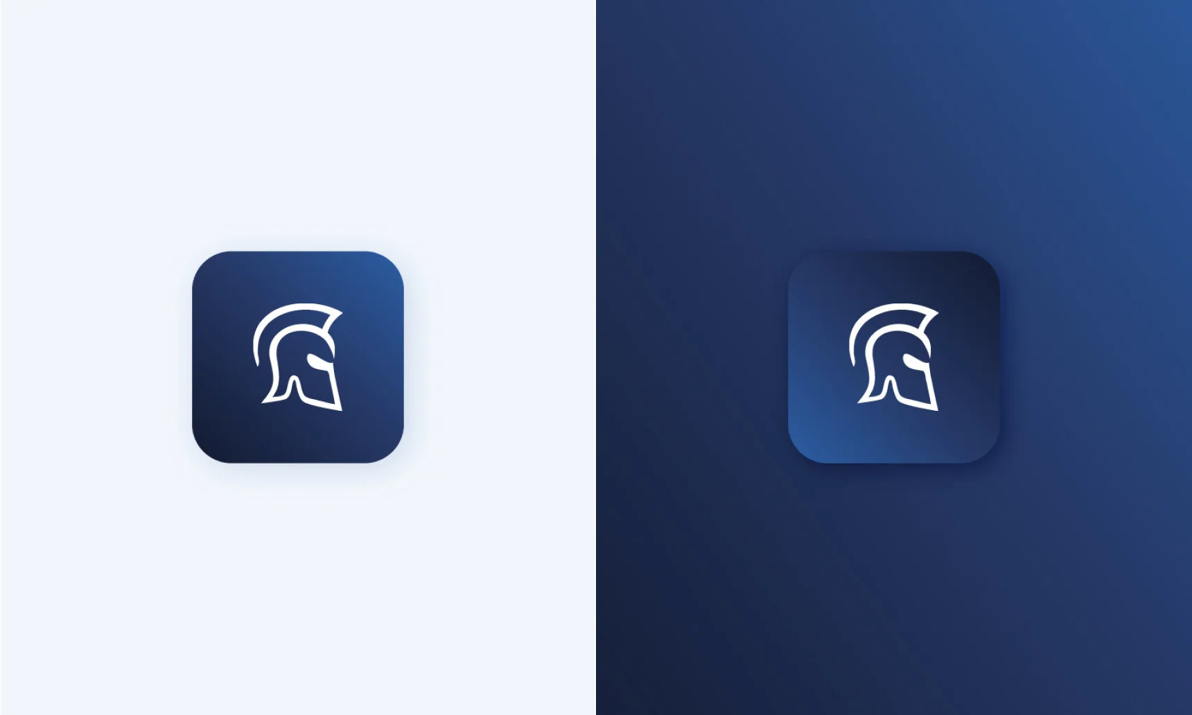
With the brand essence clearly defined, I reviewed Shephard’s existing visual assets and identified opportunities to simplify and strengthen the system. The logo and colour palette were refined to feel more confident, contemporary, and flexible, while still respecting the brand’s heritage. I then captured the uplifted brand in a single, clear document that articulated both the thinking and the practical application, and circulated it company wide. Working closely with internal teams, I developed templates and landing pages to ensure the new brand could be adopted quickly and consistently across touchpoints.

Gee is one of the best designers I have ever worked with. She easily grasps the underlying needs of a design brief and often goes above and beyond. The clarity and cohesiveness of our current brand design hierarchy is largely down to Gee's hard work in this area. Beyond her design work Gee is a great team player at work and also brings a lot extra to a business outside of her skills. We will miss her.
Darren Lake, CEO, Shephard Media
Thankyou, next...
