Building a white-label brand and atomic design system designed to scale

The challenge
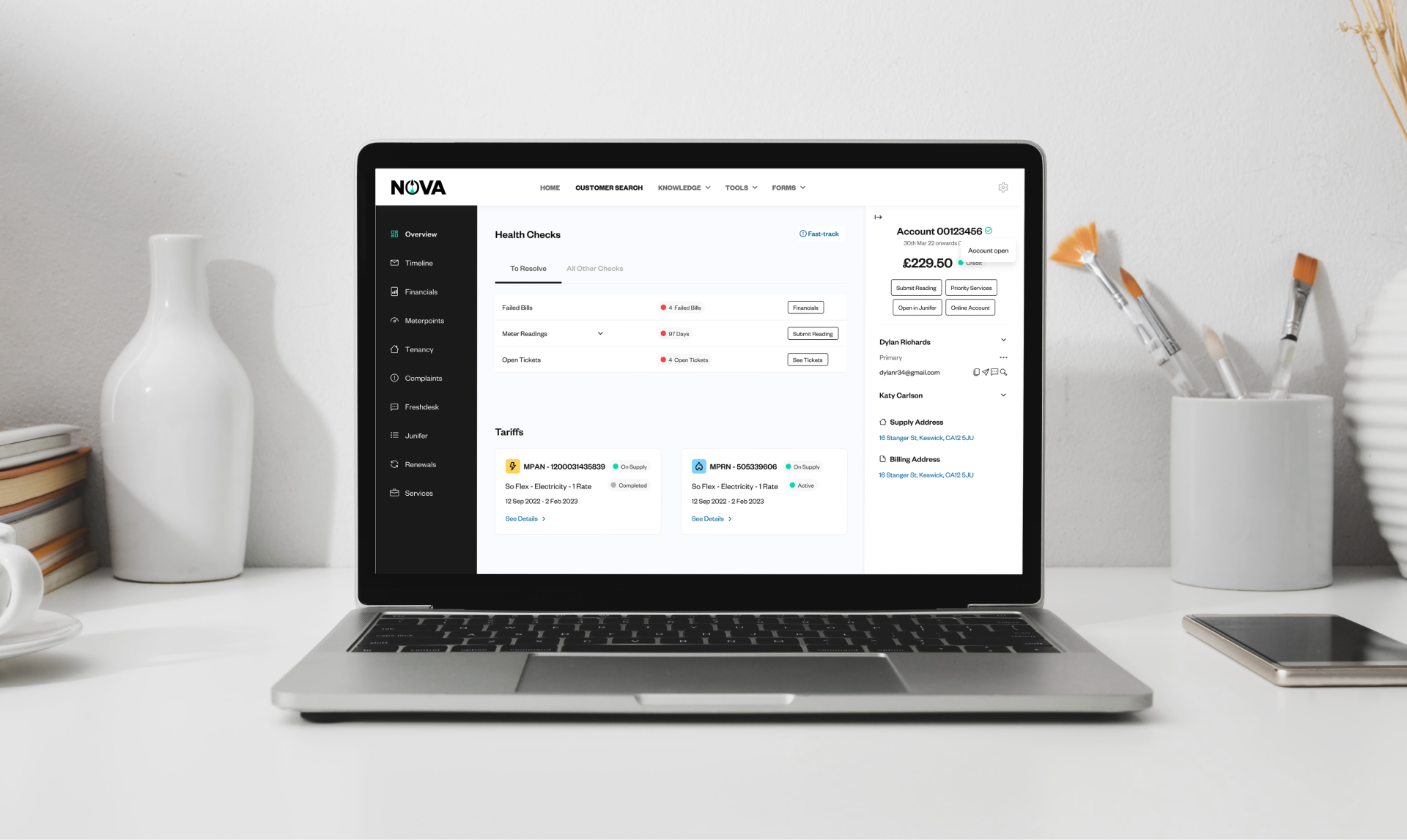
As part of the So Energy enterprise roadmap, senior leadership wanted to white-label an internal customer service platform and take it to market as a standalone B2B product. At prototype stage, the platform lacked a clear identity and wasn’t commercially presentable. Internally, the Product Design team was working across multiple, partially built design systems, which slowed delivery and made consistency hard to maintain. To succeed as a white-label product, the platform needed a credible brand, a scalable design system, and a shared way of working that empowered designers without creating fragmentation.
The solution
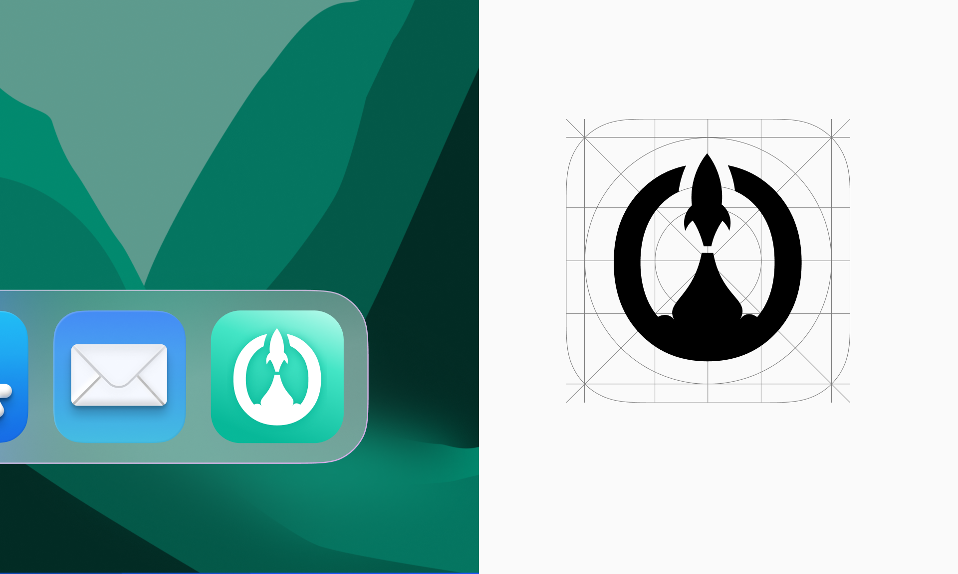
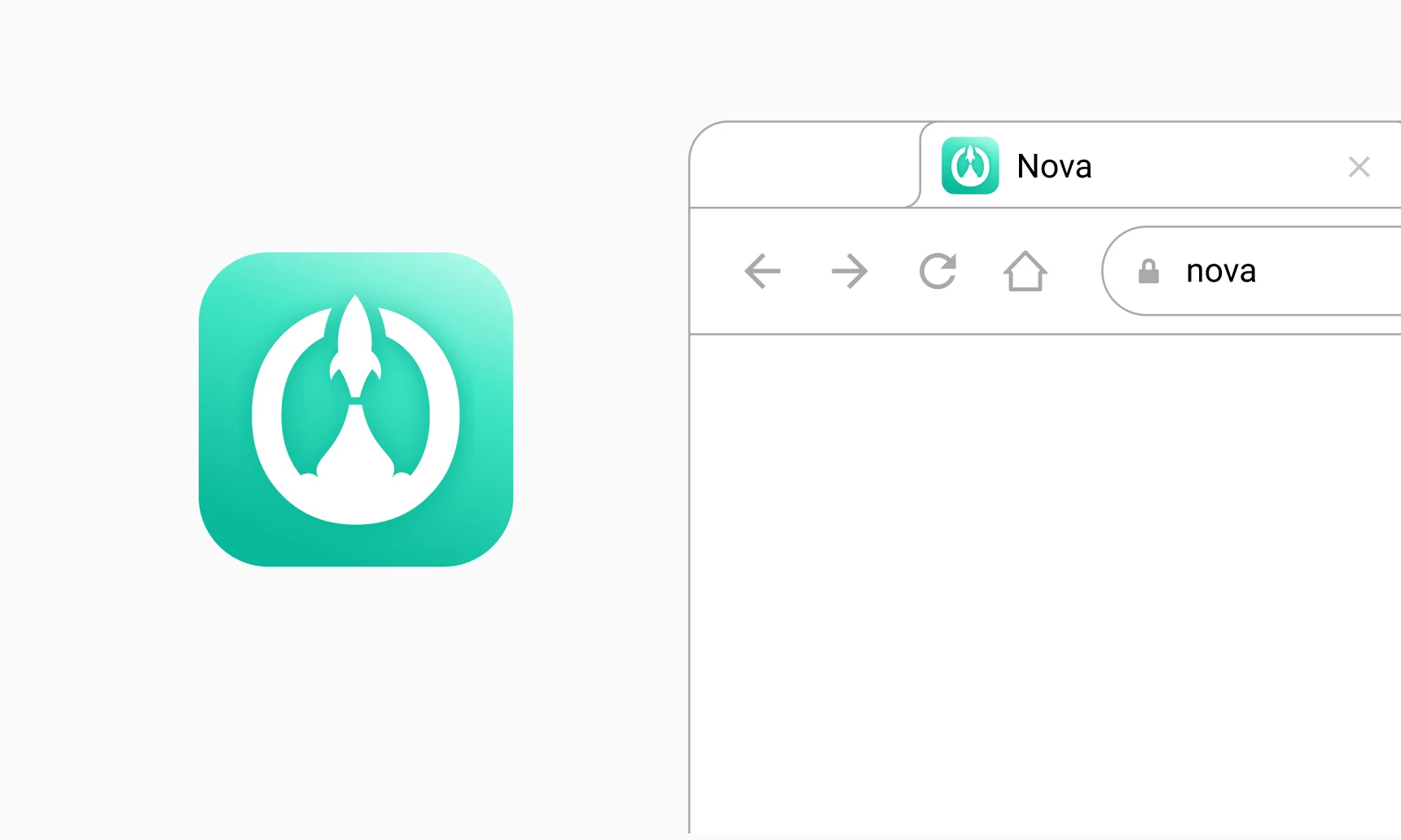
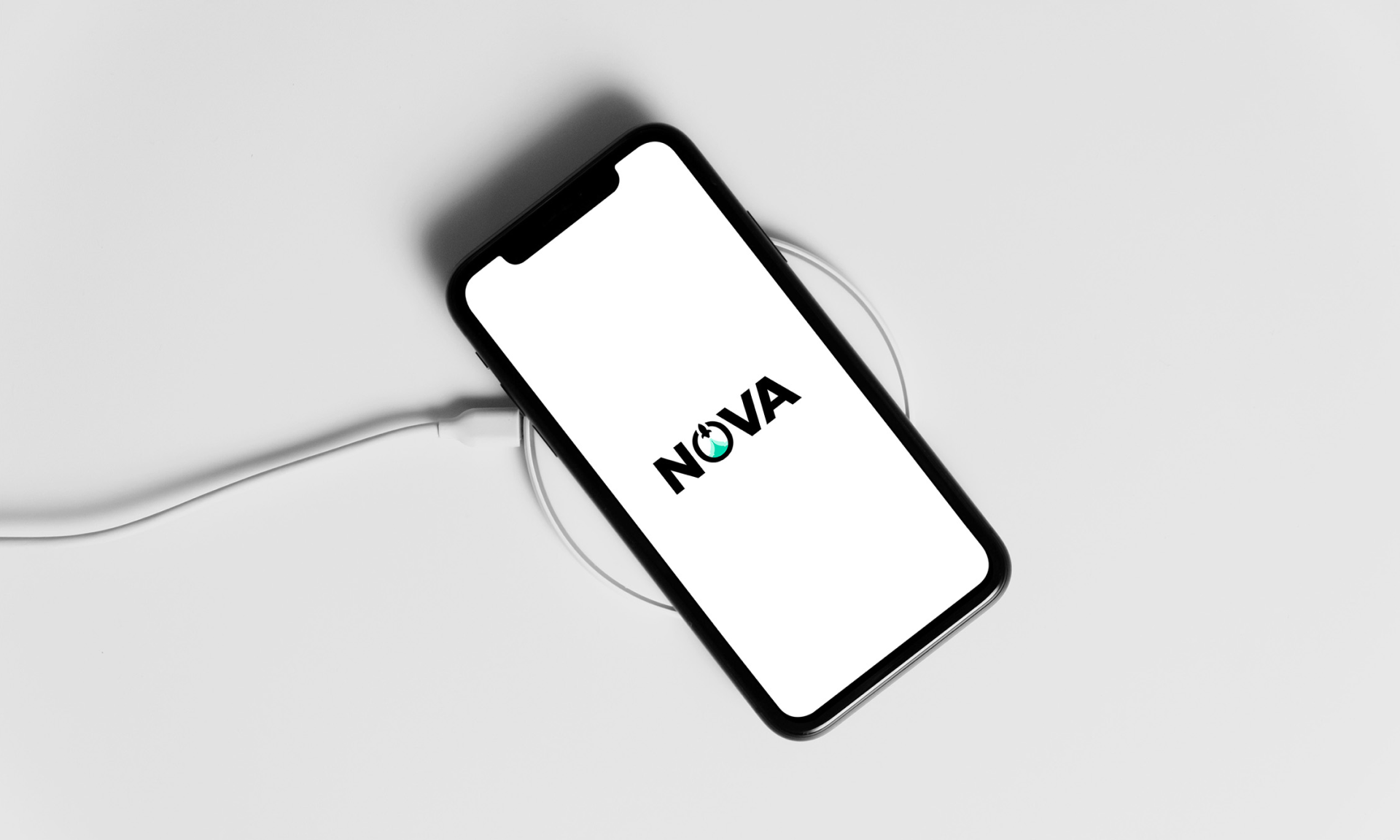
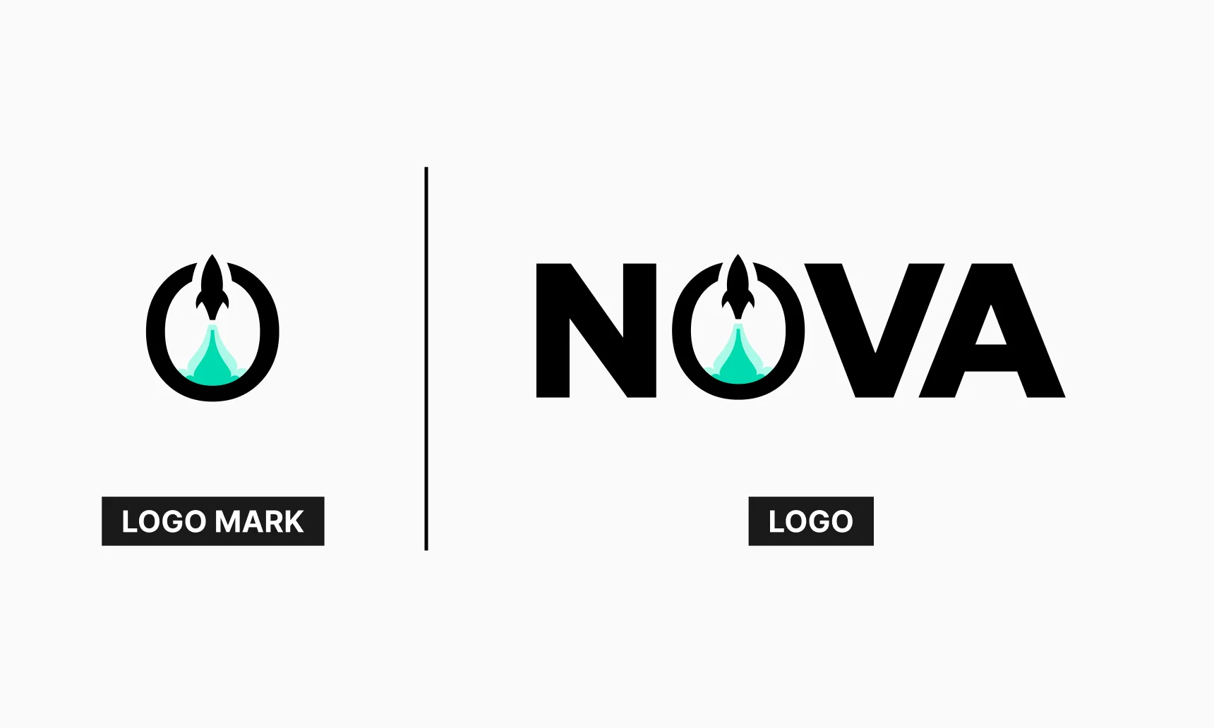
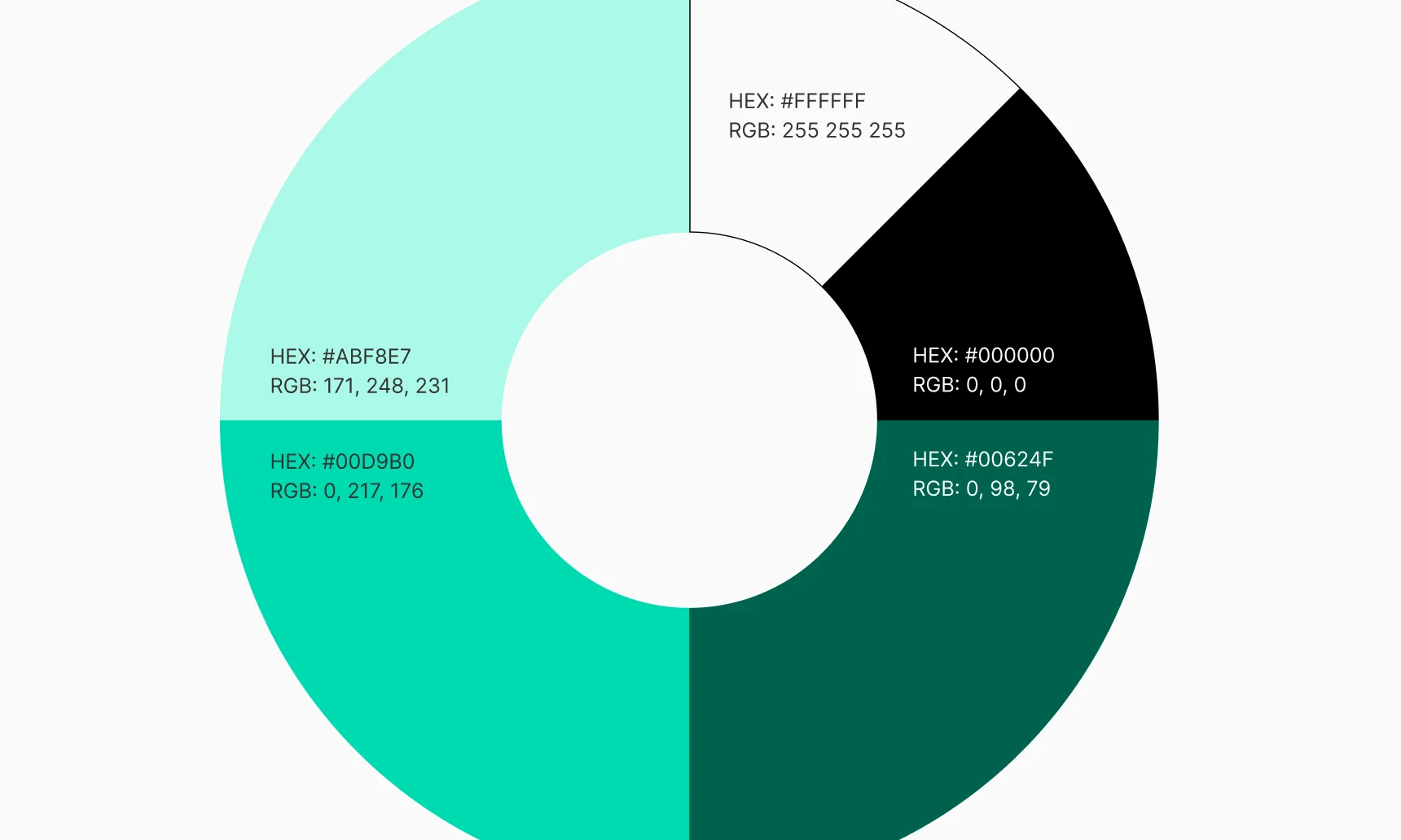
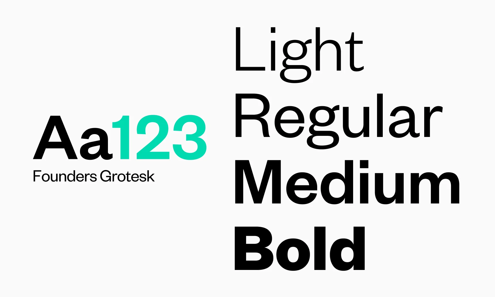
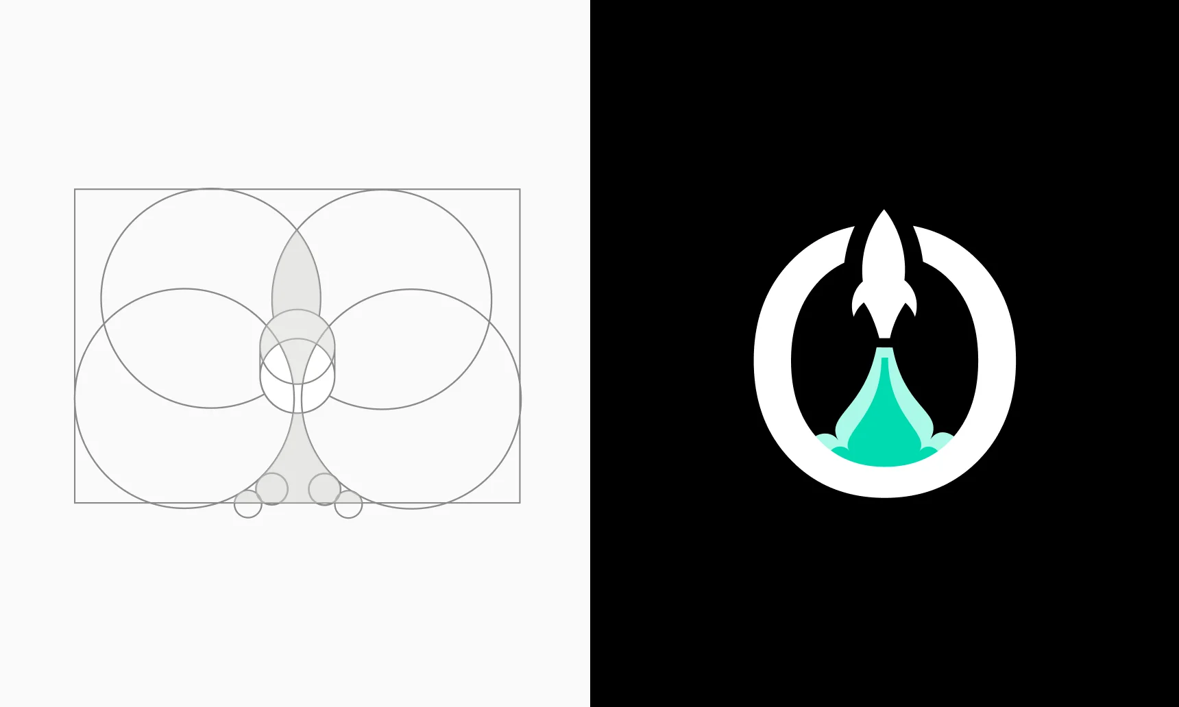
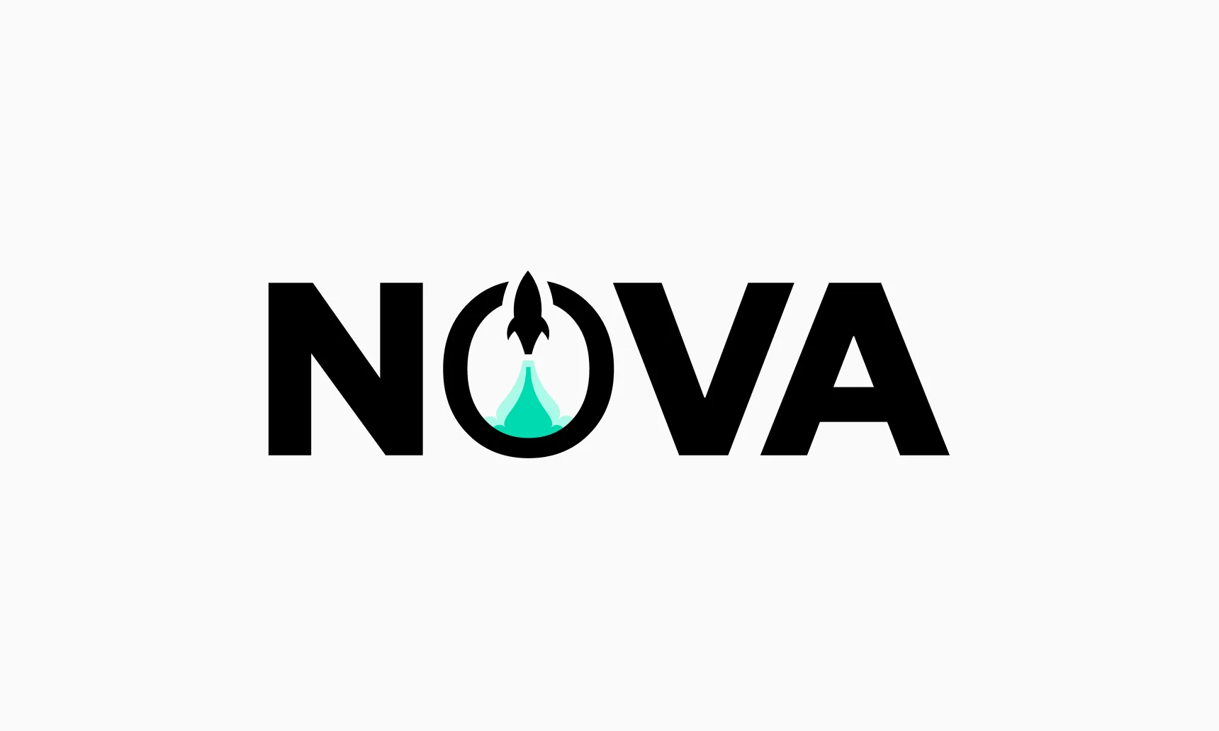
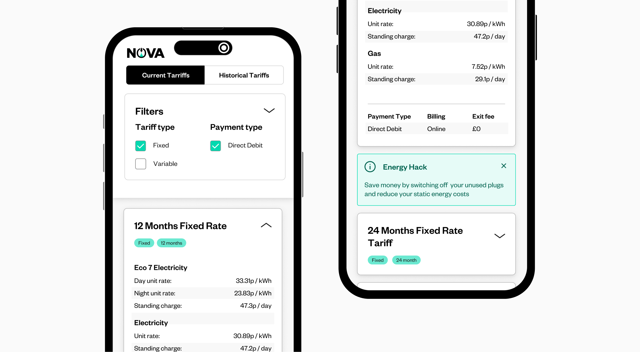
Leading the creation and rollout of a complete brand identity and atomic product design system for Nova. As Creative Lead, I shaped the logo and wider brand system, intentionally retaining the So Energy typeface as a subtle nod to the parent brand. We explored multiple visual directions inspired by the name Nova, from space and stars to energy and launch, before refining three final concepts. These were presented to the wider business and selected through a QR code voting system, ensuring company wide alignment from day one. In parallel, I established a robust atomic design system, supported by detailed component guidance covering spacing, usage and behaviour.
The strategy
Design teams rarely have time to stop and assess what’s genuinely helping them versus what’s holding them back and that was the core issue here. Coming in as an external member of the team allowed me to spot friction quickly and reset the foundations. I worked closely with the Product Design team through a series of hands-on workshops, aligning brand thinking with system design. By structuring the system from atoms through to organisms, designers were free to move fast while staying consistent. The result was a platform that could scale rapidly, be confidently marketed as a white-label product, and give the team clarity, confidence, and momentum.


Thankyou, next...
